Magazine Cover and Spreads
Overview
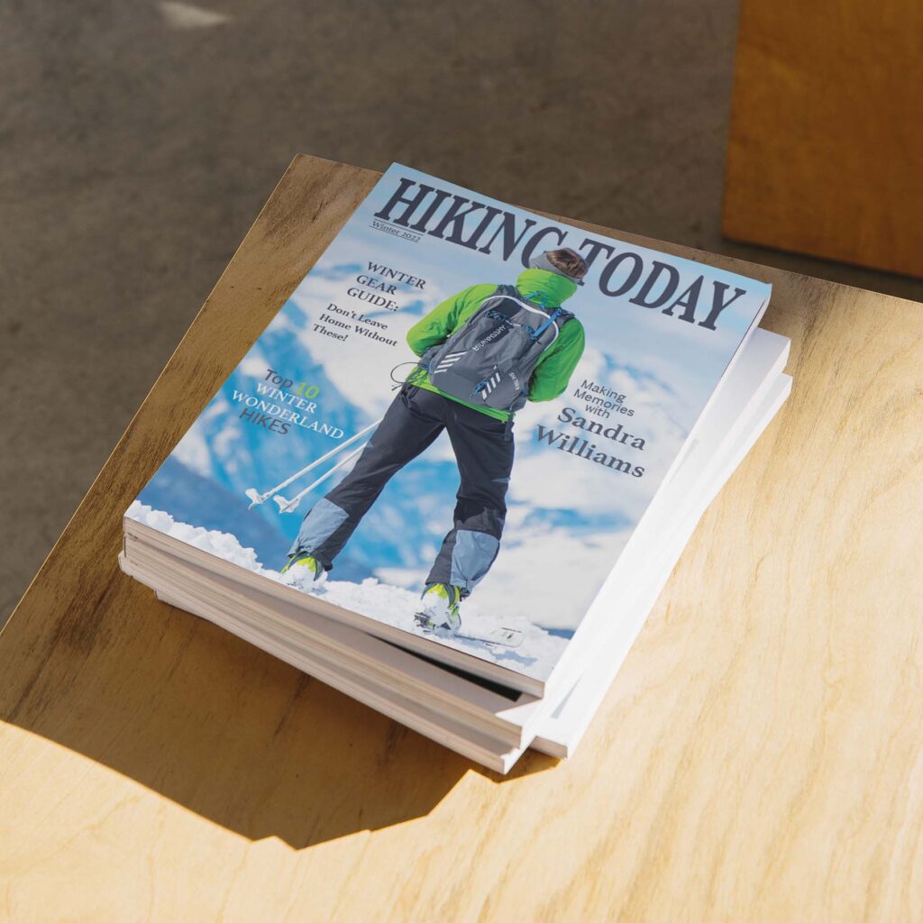
For this project I challenged myself to create a Magazine cover and two spreads one feature and one typical spread.
Software
Adobe Photoshop
Adobe InDesign
Credits
Cover Image - Stocksnap
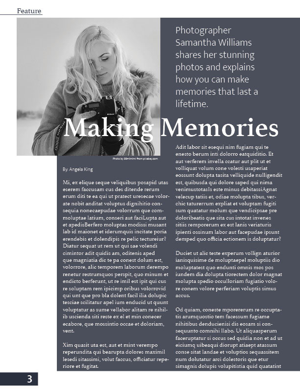
Feature Page (woman) - 99mimimi
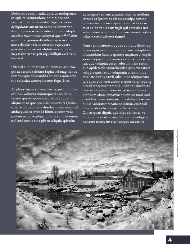
Feature Page (cabin) - unknown from pixabay.com user id possibly 3803658
Trails Page- chriszwettler on pixabay
*all content on this site is lower quality than what would print to manage weight of webpages.
Cover Elements
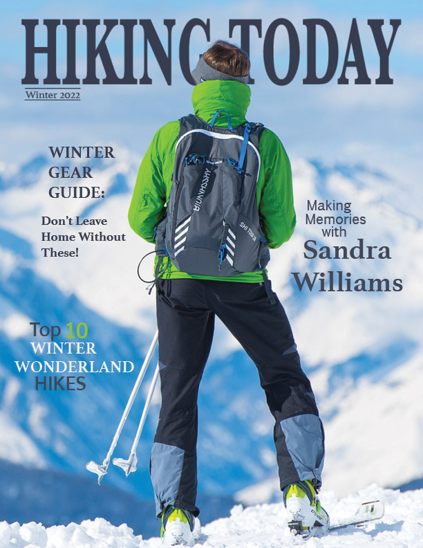
The cover includes bleeds, margins, and the typography is within the safe print area. I used color matching to match the typography to the chosen image. All of the titles are fiction so please do not hold them against me. The typography is clear and large enough to catch peoples eye from a distance. There is space saved for a bar code.
Feature Spread
A feature page typically has an indicator in the upper left corner of the page so it can be easily found by the reader. The page numbers are done on either side of the bottom and are set on the parent page so that it continues through out the whole magazine. I chose a black and white theme to fit the topic of Making Memories with photos. We often think of past photos in black and white and while this will be different in the future it lends to the mood of the piece.
The columns are wider here and there is more white space than other pages because it is a special story for the magazine and deserves to stand out. Layout is always dependent on the length of a story and the available space. When designing my own I do not have to worry about this but rest assured that it is something I think about.
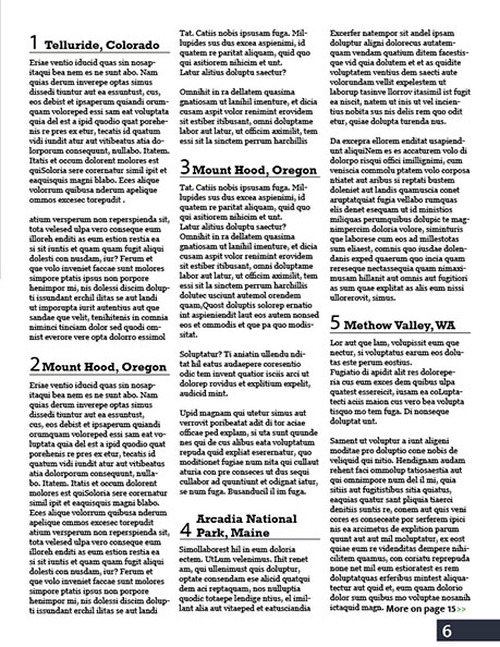
Basic Spread
I enjoyed making this spread. While it has the same parent page as the feature page I love that the image takes up an entire page but information is not lost! I used a clipping mask to design the title and gave the typography a large amount of opacity so that it could easily be seen despite the mountains in the background. I chose the image because of the space with a smaller focal point so that I could write a summary on the side of it.
This article does not end on this page and I denoted that by adding More on page 15 with green arrows. This keeps to the current magazine theme and with the change in typography and color it stands out so the reader can't miss the directions.

Contact
If you need a magazine cover or layout design reach out to me below. I can create multiple assets for your business.